|
|
Post by george111 on Apr 6, 2009 18:50:20 GMT -5
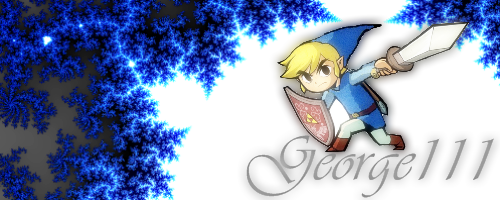
i made this sig myself on photoshop cs4, i know its a bit plain, and needs more but tell me what you think im going to be making some more, because its fun!  this is my second sig, i think i like this one a little better   |
|
|
|
Post by snotskie on Apr 6, 2009 19:18:15 GMT -5
its actually pretty good i think
i little quality work could be done to link to make it appear a little clearer (unless thats my screen, i really need to wash that... lol)
one idea, add a touch of a gradient, not much, to the bg so it seem so plain.
make it go from (darker) just below upper right corner, to (lighter) just above bottom left
this way the lighting makes link stands out and the gradient brings the eye down the path of the sword.
but still, pretty good for a first sig, i like
|
|
|
|
Post by ncromancer on Apr 17, 2009 15:06:13 GMT -5
Yes its not bad. but i think u see the white points a little bit to much in the second one. but first SIG! so Rllly thats not bad dude  |
|